Visual Exploration of Graph Data
A visual view of information helps users to accomplish a variety of important goals such as:
- Understand connections present in data
- Determine areas of interest in large amounts of data
- Identify specific patterns in data
- Quickly assess the current state and organization of data
There are many different types of visualization and some are better suited for certain goals. For example, presenting data using charts is best suited for understanding trends while showing data on a map is useful for mapping and representing geographic data. TopBraid EDG offers both of these types of visualizations. In this article, however, we want to focus on the most traditional way of visualizing graph data – diagrams of nodes with links showing connections between nodes. This capability in TopBraid EDG is provided by the EDG Diagram panel available in its editor applications. The EDG Diagram panel was designed to allow users to interact with graph data without writing any code or queries. In this article, we will describe some of its key features.
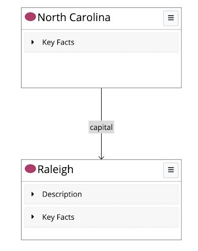
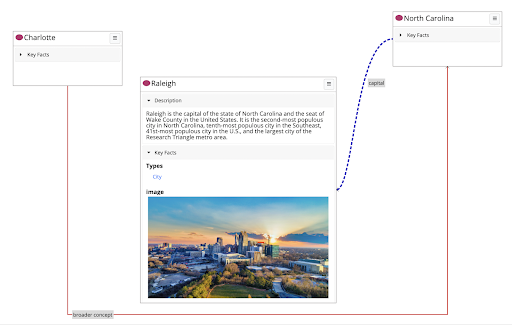
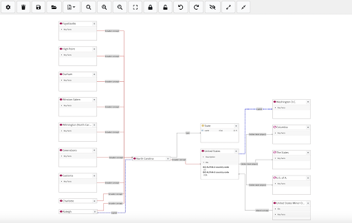
Diagrams of nodes and links are especially useful for exploring connections in data. Nodes representing resources (entities about which graph contains information) are typically displayed as either circles or rectangles. The EDG Diagram panel uses rectangular boxes for nodes because they are best suited for showing additional information about a resource in the box. For example, a simplest graph with two nodes and one relationship link between them is shown below. It contains North Carolina and Raleigh nodes with a link indicating that North Carolina’s capital is Raleigh.
If we expand sections shown in the Raleigh box, we will see some information about Raleigh. This lets us see directly in the diagram additional information about nodes.
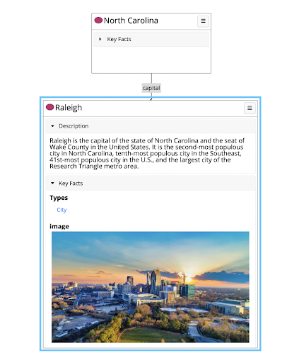
Not all information about Raleigh is displayed in its box. Our data also contains various other relationships Raleigh has with resources in the graph and its geo coordinates – none of these are shown. The box shows only values of properties that have been selected for inclusion in the box. This selection is made in ontologies where a property can be “tagged” with a role such as a “key value”. Only “key values” and “descriptions” are shown in the box. To learn more about property roles in TopBraid EDG, see https://datashapes.org/propertyroles.html.
To add resources to the diagram, users drag and drop them into the diagram canvas. As an example, we dragged and dropped Charlotte from the taxonomy tree into the diagram canvas. TopBraid EDG will automatically show relationships between the newly added resource and nodes already in the diagram. In our taxonomy, Charlotte has a “broader concept” relationship with North Carolina.
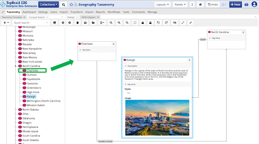
The layout of resources on the canvas is adjusted automatically, but, if desired, users can move the shapes around. Color, thickness and style of the connecting lines displaying relationships can be configured, as demonstrated by the screenshot below.
Now let’s explore more of a graph visualization. We can select any of the nodes displayed on the diagram and see its connections to other resources. This can be done without any filters – showing all connections for a node. If we expand North Carolina to show all related resources, we will get the following diagram.
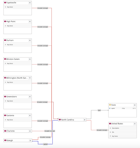
You may note a few other options in this screenshot. Users can hide all details for a node, so that only its name is shown. This was done for Raleigh, Charlotte and North Carolina in the above diagram. Buttons on the menu let you hide and unhide details of all nodes with one click. Hiding details saves real estate on the canvas when one needs to show many graph nodes at once. In addition, the diagram canvas also has zoom in and out controls and it is scrollable. With this, users are not limited to just the data that fits on a single screen.
Note the State box. It is different from other resources in the diagram because it is a class. North Carolina is a type of State. TopBraid EDG can show classes and instances in the same diagram. For more on visualization of models see our previous article, Visual Exploration of Ontologies with TopBraid EDG.
Instead of expanding the entire neighborhood for a node, we can filter the expansion by selecting relationship types to show. In the dialog below, we have picked to show only three types of relationships that exist in the data about the United States.
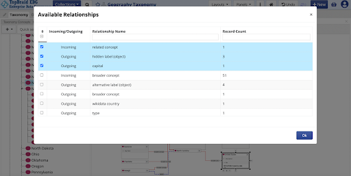
This decision can be made for each individual node or, for a diagram as a whole. If configured for the entire diagram, then expanding the neighborhood will always only display relationships configured to be shown.
Users may want to save a diagram so that they can share it with others. Diagrams can be saved directly in TopBraid EDG as named diagram objects and they can also be exported in PNG, SVG and GraphML formats. If saved in TopBraid EDG, users can come back to it later and modify it further.
Knowledge graphs are often multilingual. If this is the case, users may want to pick the language of the display. For example, the diagram below shows the display in French, where French names exist.
Another display option that more technical users may be interested in is to show QNames or URIs instead of the labels.
For larger data, the overview pane helps in focusing on different parts of the graph shown in the diagram. This panel can be toggled on and off and shown below.
Earlier in the article we showed drag and drop from the taxonomy tree panel. This is available from all panels. For example, users can run searches and then drag and drop all results presented as a tabular view into the diagram panel to explore them in the graph view – in order to more easily understand connections that could be lost in a non-visual presentation. The EDG Diagram panel lets users identify and view different aspects and slices of graph data for further analysis and discussion. It can be used to drill into specific aspects of a graph and to get a “big picture” of your data that is difficult to see using traditional tables.