Home Page and Navigation
Many views are oriented toward a particular type of asset collection, such as taxonomy, ontology, data asset collection, etc. Every view has a header that provides create new collections, a collections navigation menu, breadcrumb navigation, search, and special application links.
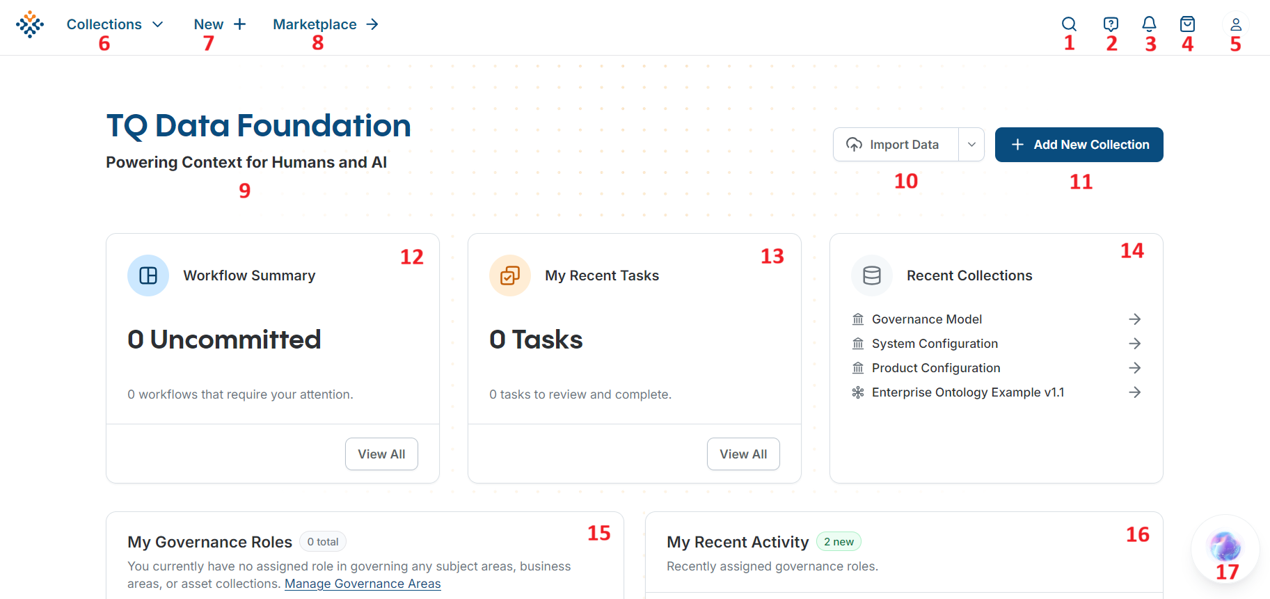
The main home view, shown below, provides access to top-level searches and other personalized widgets. See below for customizing the landing page.
Home Page
Search: Combination search feature. Search for application wide faceted searching across selected resources or Global Lookup which searches across all resources by label prefix.
Toggle Help Overlays: Shows links to the relevant documentation for certain UI elements.
Notifications: Shows all notifications for the current user.
Basket: Each user can maintain a personal list of “bookmarked” asset collections or individual assets in their Basket.
User menu: Contains links and system information.
Collections menu: Provides quick access to Asset Collections and the collection home page. (see more below)
Create New: Initiates creating a new collection. (see more below)
Marketplace: Displays all readily available datasets.
System Announcements: Announcements can be set by Administrators. (see more below)
Import Data: Initiates the data import process.
Add New Collection: Initiates creating a new collection. (see more below)
Workflow summary: Shortcut to the logged on users open workflows.
My Tasks: This widget is a personal view of open tasks assigned to the user.
Recently Viewed Collections: This widget is a personal view of the last 5 collections viewed by the user.
My Governance Roles: This widget shows which Subject Areas a user is a member of and their Governance Role within that Subject Area.
My Recent Activity: Lists important actions of users in the system.
DF Copilot: Ask questions and access information through DF Copilot.
Collections Menu
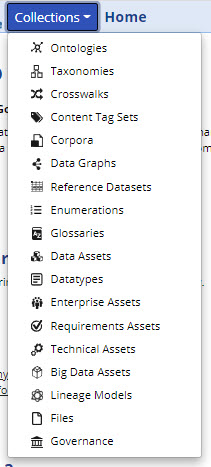
The collections menu in TQ Data Foundation provides quick access to Asset Collections and the collection home page(s) for a particular type of collection. This menu is available on all pages in the header bar. To access the collections home page, click on the menu item for that collections. For example click the word “Ontologies” to be taken to the Ontologies page. Note, this menu will look different depending on what packages you have purchased.
Collection Type Pages
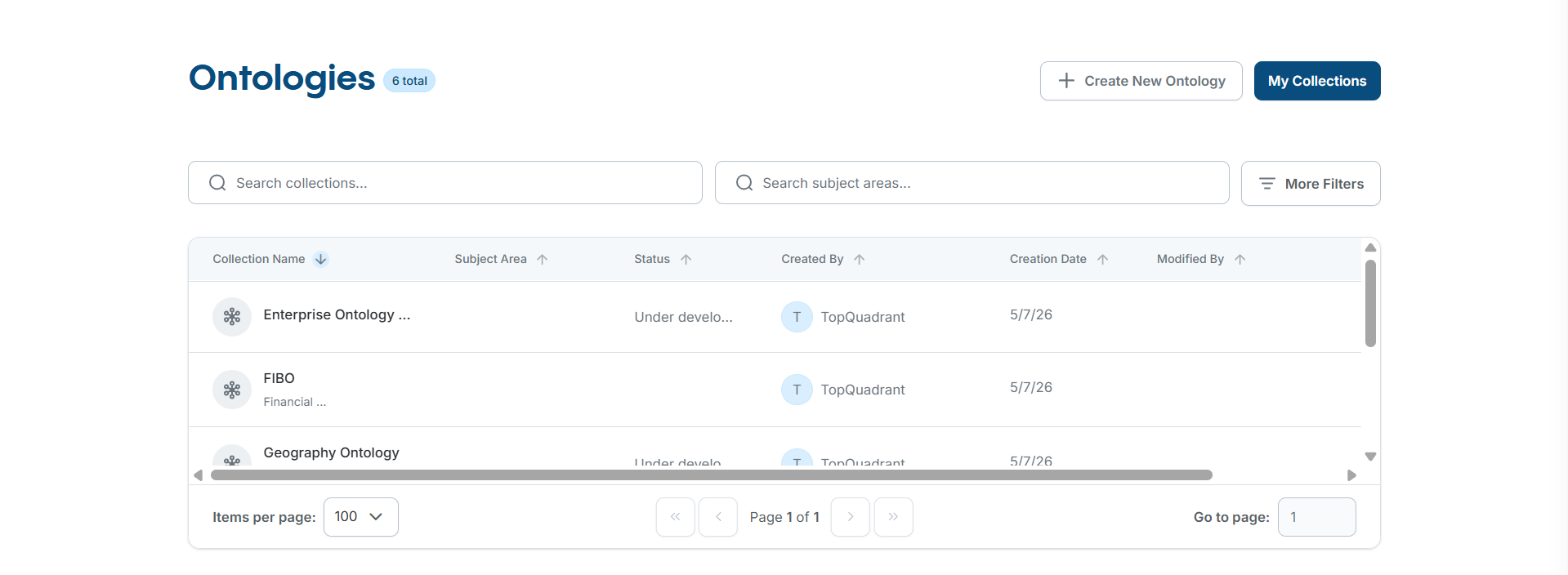
Clicking on a type of collection in the collections menu will bring you to the page listing all the asset collections of that type. The table here can be sorted and filtered.
Collection Type Page
This page can also be accessed from the Asset Collection Editor pages by clicking on the icon located directly to the left of the name of a collection in the header.
User Directory
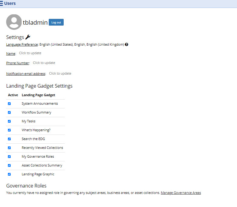
The list of all users defined in the system can be shown by clicking on the User Directory link in the user menu in the top right of the header of every page. Each user listed can be clicked on to see their details. Only users that have previously logged in to TQ Data Foundation are listed on this page, unless LDAP is configured in Server Administration. For each user, the details are as listed in the following figure.
User Settings Page
Personal Information: Non-LDAP users can define the email address that receives notifications, their name and phone number, and their profile picture. Users with Administrator privileges can edit this information for all users. Language Preference is displayed based on the browser settings of the current user.
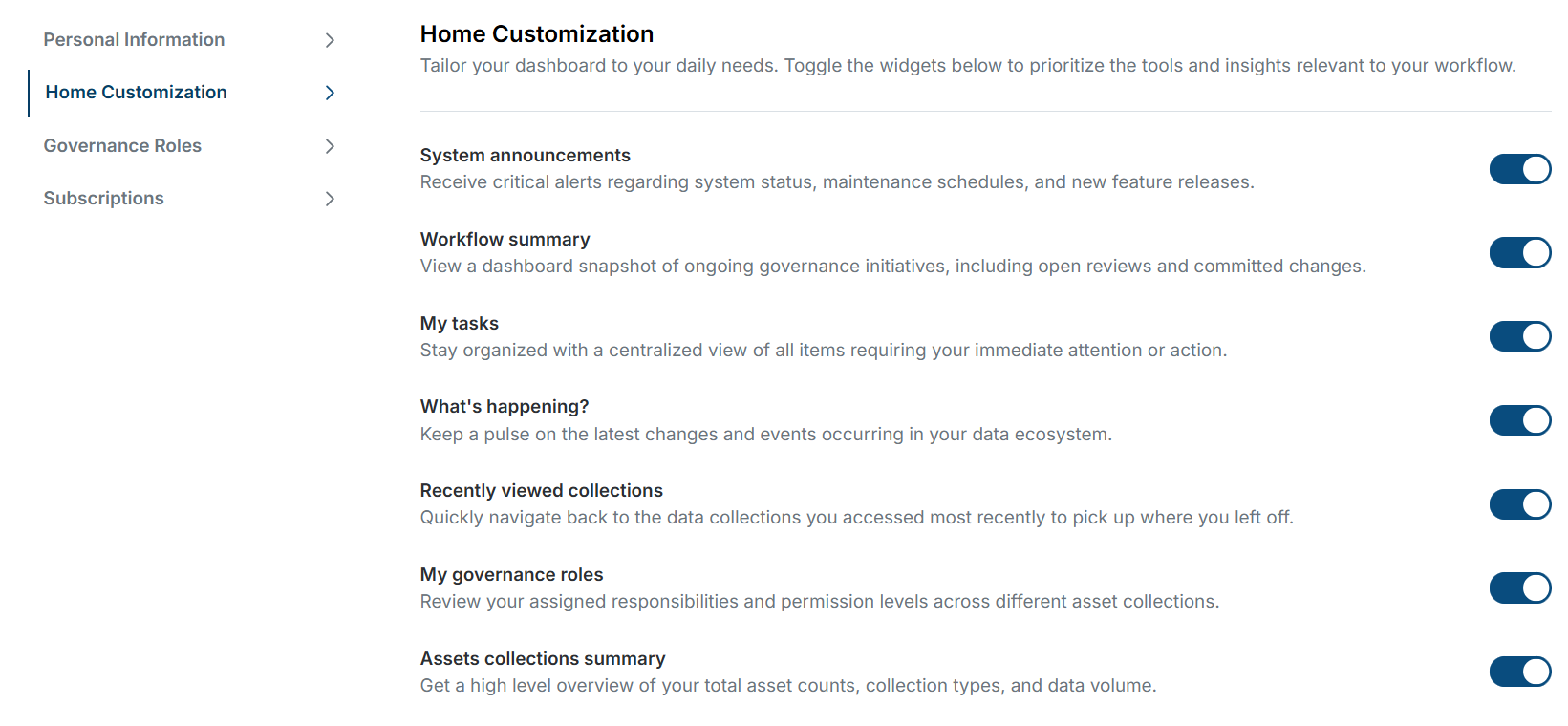
Home Customization: Users can personalize their view of the Home (landing) page. Administrators cannot edit this for individual users, only globally through Server Administration.
Governance Roles: Lists the governance roles of the selected user, if any. The list displays the name of the area or asset collection (including a link to the details page) and the governance role of the user.
Subscriptions: Allows users to set which collections they would like to receive notifications from.
Announcements
The default installation of TQ Data Foundation will have a prebuilt welcome banner and announcement on the home page. These can be modified and controlled through the Governance model.
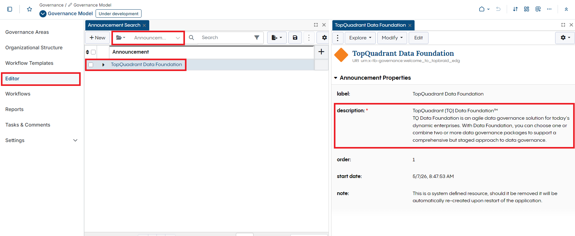
Announcements Modification Page
Navigate to Governance model, then “Editor” tab on the left.
Change the Class search to Announcement.
Select the “TopQuadrant Data Foundation” resource to bring up the form for the current default announcement.
Here you can add new announcements along the order of display and start and stop dates. Select New button from the Governance Viewpoint Search panel. Then edit the description and other properties.
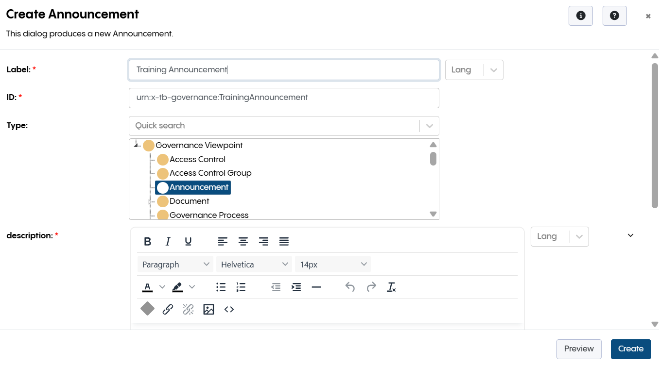
Create Announcement Form
Change the welcome banner by selecting this resource and the editing the text in the form:
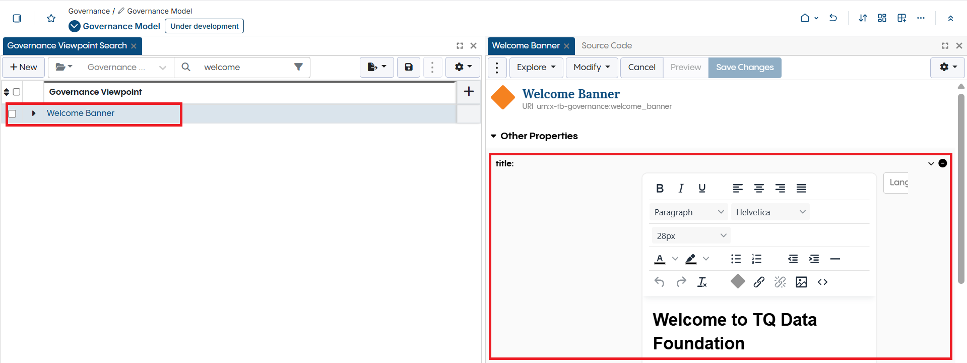
Change Welcome Banner
Customizing the Home Page
The landing page for TQ Data Foundation can be customized per instance by an administrator or per user.
Administrators can turn off or on widgets through Server Admininstration -> Product Configuration page. These settings apply to all users.
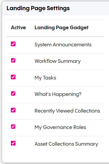
Landing Page Settings
Users can apply the same settings through their user page.
Note
Anything turned off by an administrator cannot be turned on by a user.
User Settings Page
See also
To customize the logo and other personalization see the Extension Development.